library(ggplot2)
library(gcookbook)4 Line Graphs
Today we are going through scatter plots drawing from Chapter 4 of Chang’s book.
I argue, are among the most accessible visualisations. Many visualisations can be ‘noisy.’ By this, I mean visual noise. If there are many dots, many plots, many colours, this can actual confuse more than inform.
4.1 Continuous Data Overtime
The main use of line graphs is when you have a continuous variable that you are measuring over time. These usually have the variable of interest on the y axis and time on the x axis.
ggplot(climate, aes(x = Year, y = Anomaly10y)) +
  geom_line()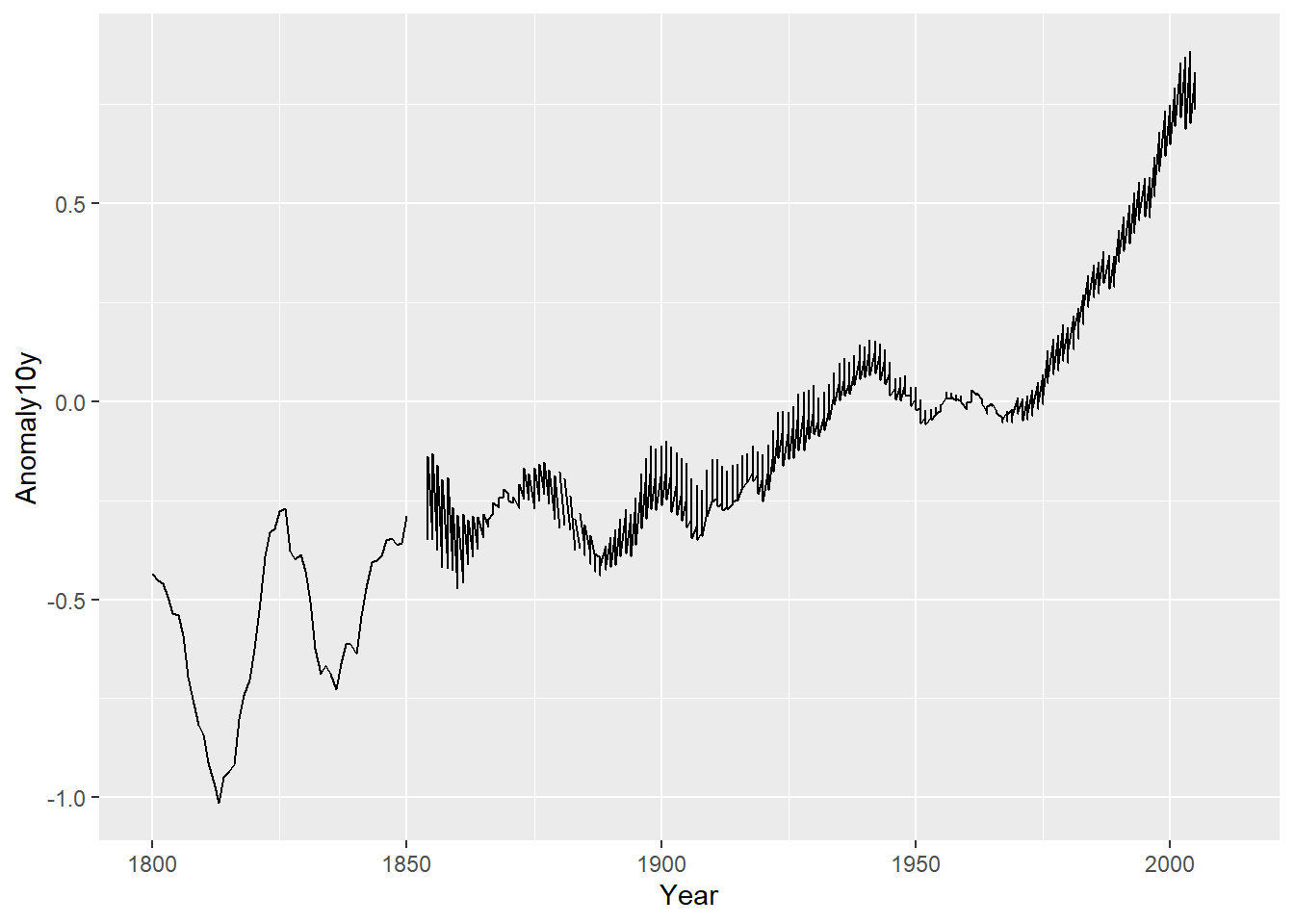
Note the small gap after 1850? This is because there are missing values in our dataset. We could remove these and re plot, but there are further issues with this visual. Take a look at the right side of the graph, notice that there are multiple points at each time period beyond 1850?
When we take a closer look at the dataset, we find out that there are three sources of data in this dataset. This may be the reason why there are multiple observations at these time periods.
head(climate) Source Year Anomaly1y Anomaly5y Anomaly10y Unc10y
1 Berkeley 1800 NA NA -0.435 0.505
2 Berkeley 1801 NA NA -0.453 0.493
3 Berkeley 1802 NA NA -0.460 0.486
4 Berkeley 1803 NA NA -0.493 0.489
5 Berkeley 1804 NA NA -0.536 0.483
6 Berkeley 1805 NA NA -0.541 0.475unique(climate$Source)[1] "Berkeley" "NASA" "CRUTEM3" Below I use the ‘colour’ option to divide the lines by these sources.
ggplot(climate, aes(x = Year, y = Anomaly10y, colour = Source)) +
geom_line() 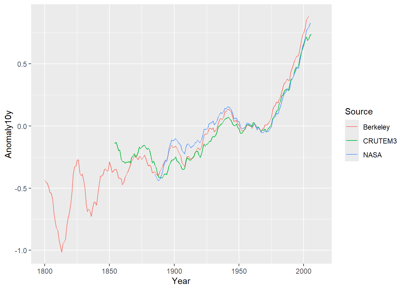
Yes! There is the culprit! This is a powerful lesson when using line graphs to know your dataset well. If there are multiple points at each time period, a line graph can look very ugly and confusing. Understanding why there are multiple points can help you edit your visual accordingly.
Now, even this visualisation is a little messy. First, each source line begins at a different time point with Berkeley being the longest. Second, the lines overlap each other quite a bit. If your purpose is to compare these sources, there are a few options to fix these issues.
First, you can limit the x axis to the point at which each source have data. Here I add the xlim() option and limit the left side of the axis at 1890. The NA simply leaves the right side of the axis unaltered. You can add a value there to alter that side as well. This produces a plot that is less distracting making it easier to compare these sources.
ggplot(climate, aes(x = Year, y = Anomaly10y, colour = Source)) +
  geom_line() +
  xlim(1890, NA)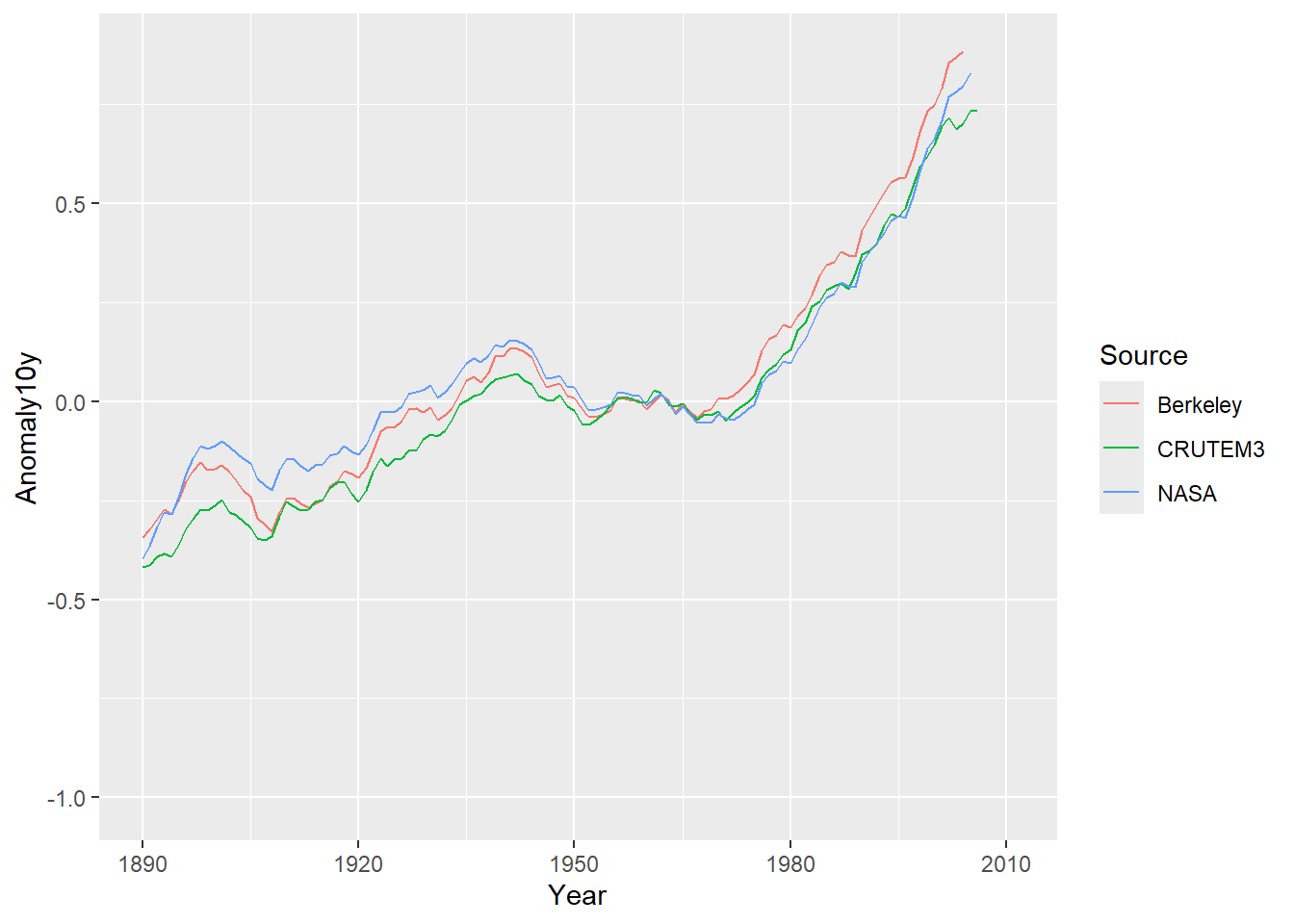
Second, you may wish to pull each of these sources out into separate plots and present them side-by-side. To do this, we can use the facet_grid() option from ggplot2. The facet_grid() option uses a categorical variable (like our source of data) to separate the data by these categories. This will pull each line into a plot and present it. I also use the theme() option to remove the legend that we normally see because of the line colour option we used. If you don’t add this, then you will see a legend on the plot. This, however, is redundant because each facet is titled by the source name.
ggplot(climate, aes(x = Year, y = Anomaly10y, colour = Source)) +
  geom_line() +
  xlim(1890, NA) +
  facet_grid(~ Source) +
  theme(legend.position = "none")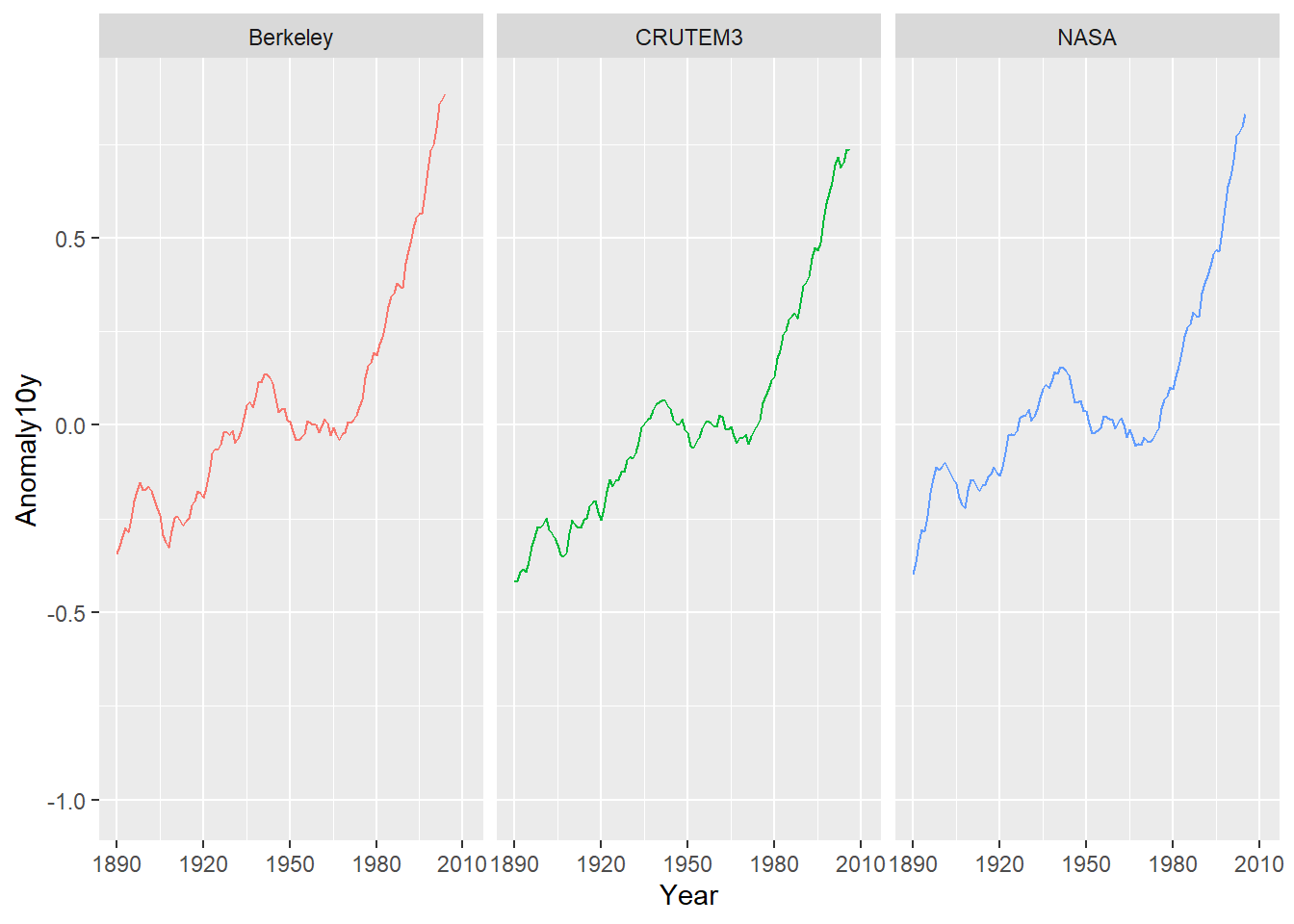
4.2 The Relationship Between Two Variables
One lesser-known use of line graphs is to plot the relationship between two variables. However, a key caveat is that line graphs should only be used in this context when there is a single observation for each point along the x-axis. If there are multiple observations for a given x-value, a scatter plot is generally more appropriate.
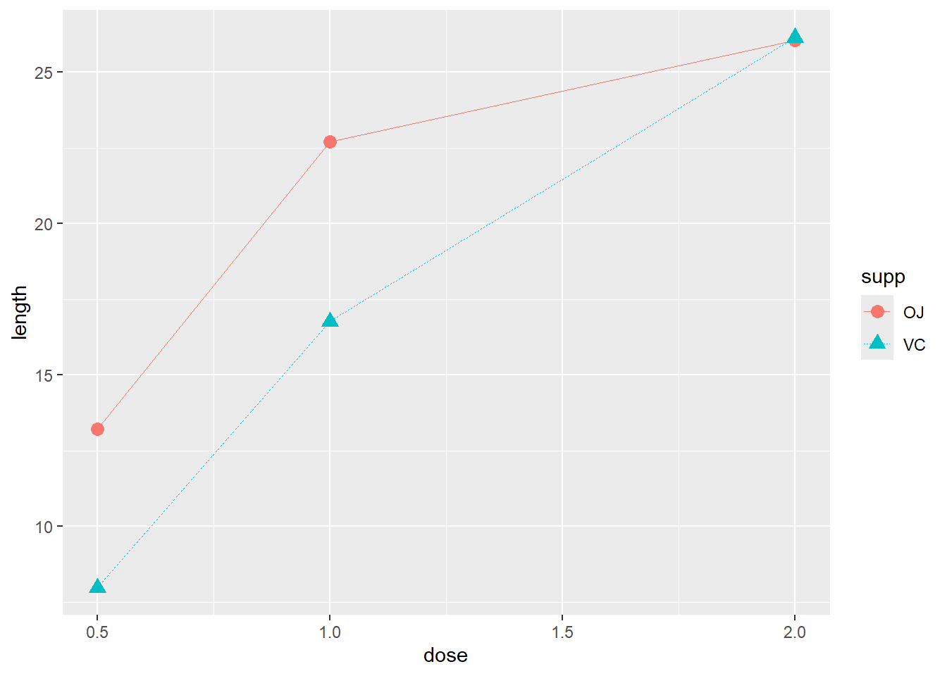
Here is an example. We are using the tg dataset which measures the tooth length of guinea pigs who were given doses of different medicines. Here we can graph the relationship between the dose amounts and the tooth length. But, there are two points at a few of the x-values.
ggplot(tg, aes(x = dose, y = length)) +
  geom_line() +
  geom_point()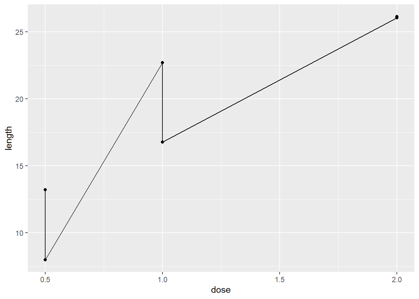
head(tg) supp dose length
1 OJ 0.5 13.23
2 OJ 1.0 22.70
3 OJ 2.0 26.06
4 VC 0.5 7.98
5 VC 1.0 16.77
6 VC 2.0 26.14When we look closer at the dataset, it looks like there are two groups, those that received an orange juice supplements or vitamin C supplements.
4.3 Activities
So, what can you do to visualise this and create an appropriate line graph?* Consider using the linetype, shape, or color options in the aes() functions.
From Winston Chang’s R Graphics Cookbook:
4.3.1 4.6
- Line graphs with shaded area.
4.3.2 4.7
- Stacked area graphs. CAUTION - Not easy to interpret.
*My Answer
ggplot(tg, aes(x = dose, y = length, linetype = supp, shape = supp, colour = supp)) +
  geom_line(size = 0.25) +
  geom_point(size = 3)